Mapping: Understand your workplace through maps and charts
To effectively organise your workplace and help grow your union, you need a plan.
We call the process of gathering information on union membership in your workplace “mapping”.
“Maps” are visual summaries of where your members are and who you need to ask to join. They help you prioritise your actions and work out where you are strong.
Different types of maps for different purposes
Map 1: membership map
A membership map or chart (terms used interchangeably) will tell you which workers at your organisation are and aren’t members. It might record information about where they work and what issues they are concerned about at work.
This will give you a clear sense of who you need to speak to and what issues people have in common.
You should try to answer these questions:
- Who are they?
- What do they do?
- Are they a member?
- What do they want? What do they care about?
You should end up with a table that looks a bit like this:
| Department | Employee | Member? | Location | Issues |
|---|---|---|---|---|
| Cleaning | John T | N | Coventry | Rota |
| Cleaning | Chloe K | Y | Coventry | Rota |
| Engineer | Didier D | Y | Rugby Depot | Parental leave |
| Admin | Ange P | Unknown | Unknown | Unknown |
Before mapping your workplace membership, you should first find out what your branch is already doing and if they already have a membership map. See this page for more information:
If you are making one from scratch, follow these simple steps:
| Step | Description | Where to find the information |
|---|---|---|
| 1 | List all the departments in your organisation | Employer intranet, Annual Reports |
| 2 | List all the staff in each department (please see our guide to data protection) | Employer intranet, speaking to colleagues |
| 3 | Find out which of these staff are members | Speak to staff directly; speak to your branch secretary or Prospect Organiser |
| 4 | Find out what issues matter to staff in different teams | Speak to staff directly; employer survey; run your own survey |
A note on data:
Membership of a trade union is protected data under GDPR, so keep your staff map confidential and secure – keep it off your work system, password protect it, and limit who has access.
If you are collecting data from non-members, please look at our GDPR guidance and speak to your Prospect Organiser: GDPR advice for reps | Prospect
xxxx
Adding detail
You can add any detail you think is relevant to your map. This could include:
- Work locations and patterns (remote, which days they are in the office)
- Salary, job title, length of service
- Who do they talk to at work?
- Union activities they’ve taken part in
Using your chart to show membership strength
Unions talk about ‘density’ to mean the number of members in a particular workplace or team. The more members you have as a percentage, the stronger you are.
If everyone in your team is a union member, your density is 100%. If half the people are members, your density is 50%.
By making a clear chart showing membership density, you can see which teams you need to target. Here is an example:
| Team | No. of employees | No. of members | Density |
|---|---|---|---|
| Cleaners | 8 | 4 | 50% (4 out of 8) |
| Engineers | 10 | 7 | 70% (7 out of 10) |
| Admin | 12 | 3 | 25% (3 out of 12) |
| To find the percentage, divide number of members by number of employees and multiply by 100. | |||
In this chart you can see that there are a lot of engineers who are union members but not many administrators. If you want to grow the union, where should you start?
Here's another more detailed mapping example from Labornotes
Map 2: Staff networks and organisation charts
You might have seen a chart like this one before. It’s usually called an ‘org chart’ or an ‘organogram’ – your employer will probably have one.
They show how your boss sees your workplace – them at the top, and a rigid hierarchy underneath.
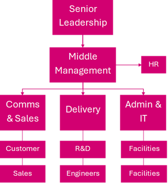
Organigrams can be useful to trade unions – for example, we can use them to see how many members we have in the admin team. But they don’t tell anywhere near the whole story.
That’s because workplaces are made up of people, who interact with each other in ways your boss can’t necessarily control. Here is another type of chart:
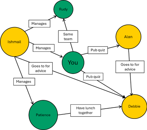
It shows you and your colleagues, and the formal and informal connections you have to one another.
Identify influential workers to recruit
You can see that a lot of people know Debbie. She’s respected by Ishmail, the manager, who goes to her for advice; and she socialises with most people. Debbie might be very influential but might not be recognised as such by management.
Maps like these show the real layout of power in the workplace. Often, it doesn’t matter who the boss thinks is in charge – it matters who people trust.
Now, you can also see that Debbie is not a union member. If Debbie were to join, she could be very useful.
We call workers like Debbie ‘Influential workers’, or ‘natural leaders’.
Other types of map
Next steps
- Join our Building Power at Work training
- Talk to your colleagues about joining the union
- Identify issues to campaign around
- Plan your campaign